A happy business card is not just about bright colors or playful fonts. It is a strategic design choice that improves recall, builds emotional connection, and increases follow-up rates. Studies in branding psychology show that emotionally engaging visuals can improve memory retention by up to 70%, which directly impacts how often your card leads to a response.
Most business cards fail because they feel generic. They look professional, but they do not create a reaction. A happy business card solves this by combining emotional design, clarity, and usability. The result is a card people keep instead of discard.
This article focuses on exactly how to design a happy business card that works. You will learn what elements matter, what mistakes reduce impact, and how to apply practical ideas immediately.
Now let’s break down what actually makes a business card feel “happy” and not just colorful.
What Makes a Business Card “Happy”?
A happy business card is built on emotional design principles. It creates a subtle positive reaction within seconds. That reaction is what increases memorability and engagement.
The concept aligns with emotional design theory, which you can explore further on Wikipedia. In simple terms, people respond faster to feelings than logic. Your card should trigger that feeling instantly.
But emotion alone is not enough. The design must still be readable, brand-aligned, and practical. That balance is where most designs fail.
So the next step is understanding the specific elements that create that balance.
Core Elements of a High-Impact Happy Business Card
Color That Feels Positive, Not Overwhelming
Color is the first thing people notice. Research shows that color increases brand recognition by up to 80%.
Use colors like:
- Soft yellow for warmth
- Coral for friendliness
- Light blue for calm positivity
Avoid using too many bright colors together. That creates visual stress instead of happiness. Limit your palette to 2–3 main colors.
This leads directly to the next element—typography.
Typography That Feels Approachable
Fonts shape perception more than most people realize. Rounded fonts feel friendly. Sharp fonts feel formal.
A practical approach:
- Use one playful font for your name or tagline
- Pair it with a clean sans-serif for contact details
This keeps the card readable while adding personality.
Now that the visual tone is set, the message itself needs attention.
Messaging That Creates a Human Connection
Most cards say things like “Marketing Manager.” That is functional but forgettable.
A happy business card adds personality:
- “Helping brands grow with clarity”
- “Coffee lover & creative problem solver”
This small shift makes the card feel human. It also gives people something to remember or talk about.
And once messaging is clear, the physical feel of the card becomes important.
Material and Texture That Enhance Experience
A soft-touch matte finish feels premium and calming. Textured paper adds uniqueness. These small details influence perception instantly.
In industries like wellness or food, material choice can reinforce your brand identity without extra design effort.
Now that the fundamentals are clear, let’s move into practical ideas you can actually use.
Practical Happy Business Card Ideas That Work
Here are proven ideas that go beyond basic templates:
- Use a simple illustrated character that represents your brand
- Add a QR code linking to a short welcome video
- Design the card like a mini thank-you note
- Use subtle patterns like confetti or soft gradients
- Create a dual-purpose card (discount coupon + contact info)
- Add a handwritten-style element for authenticity
- Use die-cut shapes to break the standard rectangle
Each of these ideas works because it adds a small moment of surprise. That surprise is what makes people keep the card.
To visualize how these ideas come together, look at the examples below.
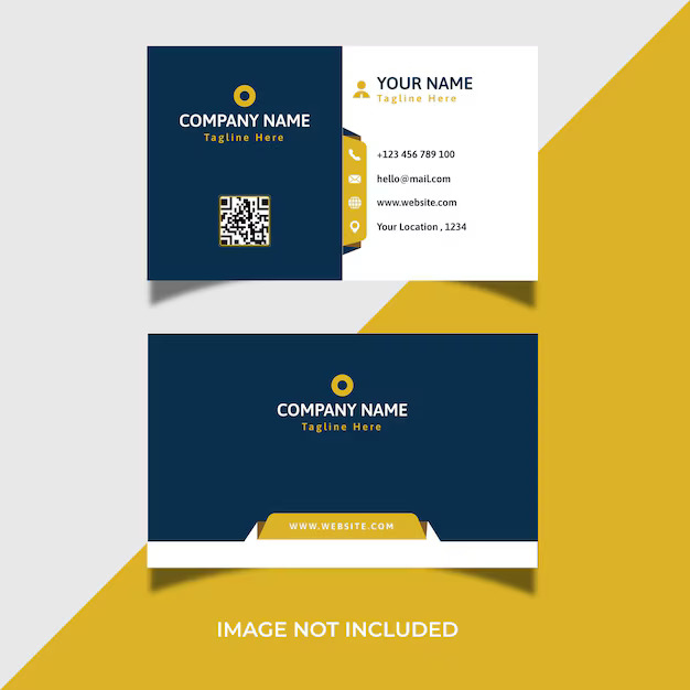
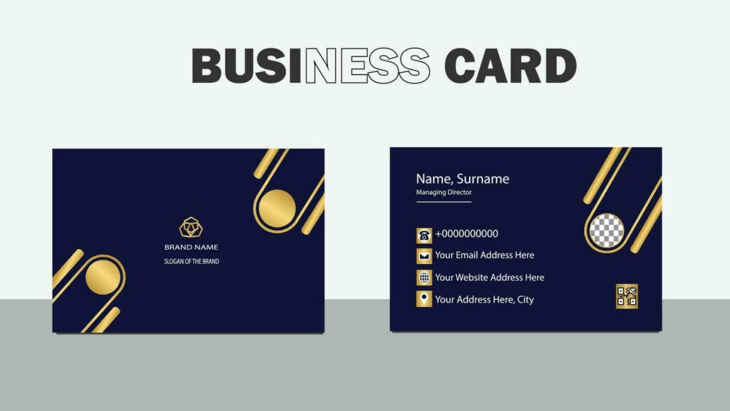
Example of a Happy Business Card Design
These types of designs combine color, simplicity, and personality. Notice how they avoid clutter while still feeling expressive.
This brings us to an important point—different industries require different approaches.
Industry-Specific Approaches That Actually Work
A happy business card should match your audience expectations.
For creative professionals, bold visuals work well. Designers and photographers can push boundaries without losing credibility.
This For food businesses, warm colors and textured materials create appetite appeal.
For kids and family brands, bright colors and playful graphics are effective.
,For wellness professionals, happiness should feel calm, not loud. Soft tones and minimal layouts work better here.
Choosing the wrong style for your industry reduces effectiveness, even if the design looks good.
And this is where many people make mistakes.
Mistakes That Reduce the Impact
Some common errors can completely cancel the “happy” effect:
- Overcrowded layouts that feel stressful
- Too many colors competing for attention
- Fonts that are hard to read
- Designs that do not match the brand
A happy design should feel effortless, not chaotic. If it takes effort to read or understand, it fails.
So the next step is knowing how to build it correctly from scratch.
Step-by-Step Process to Design a Happy Business Card
Start with your brand emotion. Decide if your version of happiness is fun, calm, or energetic.
Then choose your color palette. Keep it limited and consistent.
Select one standout element. This could be an illustration, texture, or message.
Add a human touch. This could be a friendly tagline or a small visual detail.
Finally, test readability. If someone cannot scan your card in 3 seconds, simplify it.
This structured approach removes guesswork and improves results.
Final Thoughts: Making Your Card Worth Keeping
A happy business card works because it combines emotion with clarity. It does not rely on decoration alone.
People keep cards that feel personal, useful, or slightly different. That is the goal.
If your card can create a small positive reaction and still deliver clear information, it will outperform most standard designs.
And that is what turns a simple business card into a real networking tool.